We developed the mascot and brand film for Adnaut, a digital media consultancy. We were brought in to ensure the mascot was built for motion from the start, and to help launch their new brand into the world.
Client
Adnaut
Industry
Ad-Tech
Duration
1:07

Context
Adnaut, previously RTBAnalytica, is a digital media consultancy that helps advertisers make data-driven decisions to boost business outcomes. They had world-class proprietary tech and a brilliant team, but their brand didn't reflect that strength. The technical name made it difficult to build recognition, coming in the way of attracting larger clients and gaining industry visibility. They needed a complete rebrand to position themselves as leaders in the ad-tech space.
Everything Design handled the full scope: naming, brand strategy, visual and verbal identity, collaterals, and website. The rebrand repositioned them as Adnaut.
Everything Design handled the full scope: naming, brand strategy, visual and verbal identity, collaterals, and website. The rebrand repositioned them as Adnaut.
Brief
With the new brand in place, Adnaut needed a launch asset that could introduce them to the ad-tech audience while communicating the business and its offering.
The motion team's involvement began during the visual identity phase for designing the mascot, ensuring the brand's face was designed for motion from the start. Following the brand's completion, the team developed the brand film to launch the rebrand.
The motion team's involvement began during the visual identity phase for designing the mascot, ensuring the brand's face was designed for motion from the start. Following the brand's completion, the team developed the brand film to launch the rebrand.
The Solution
The Mascot
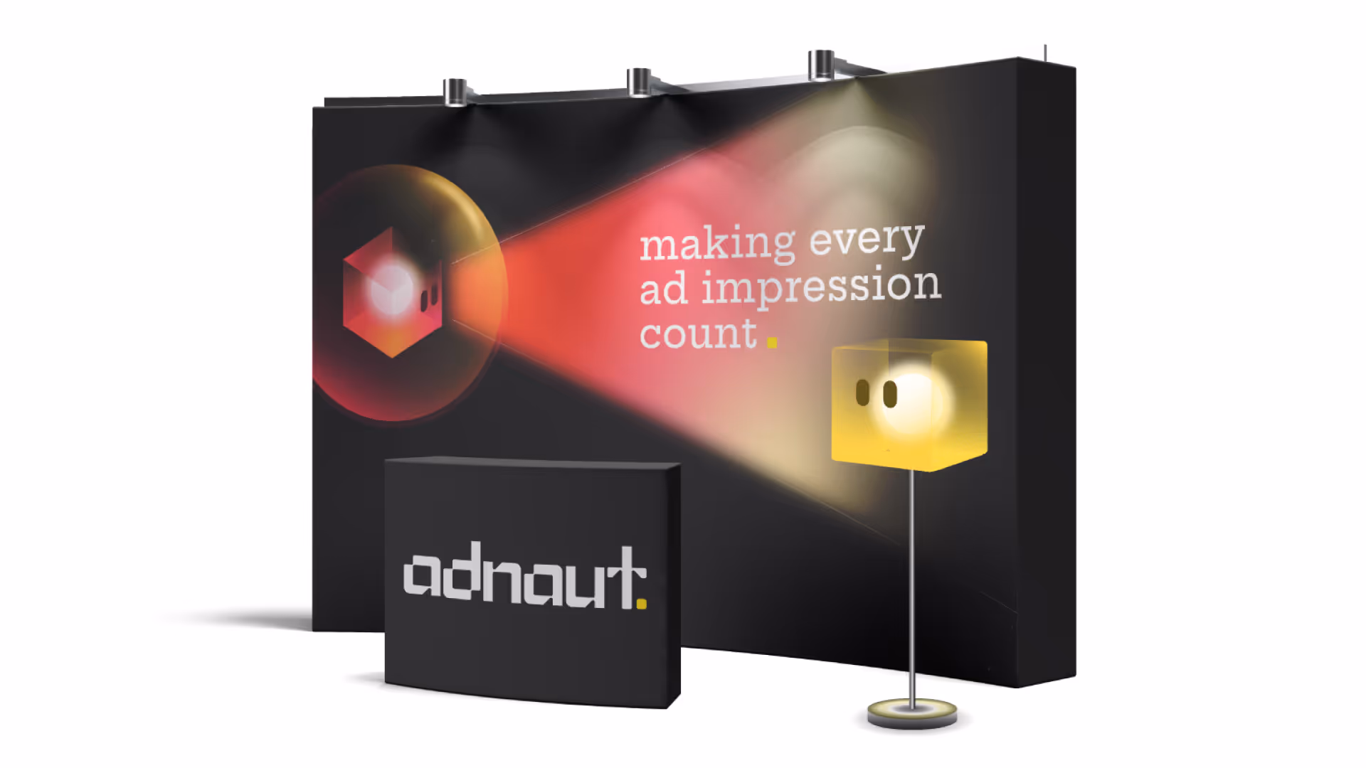
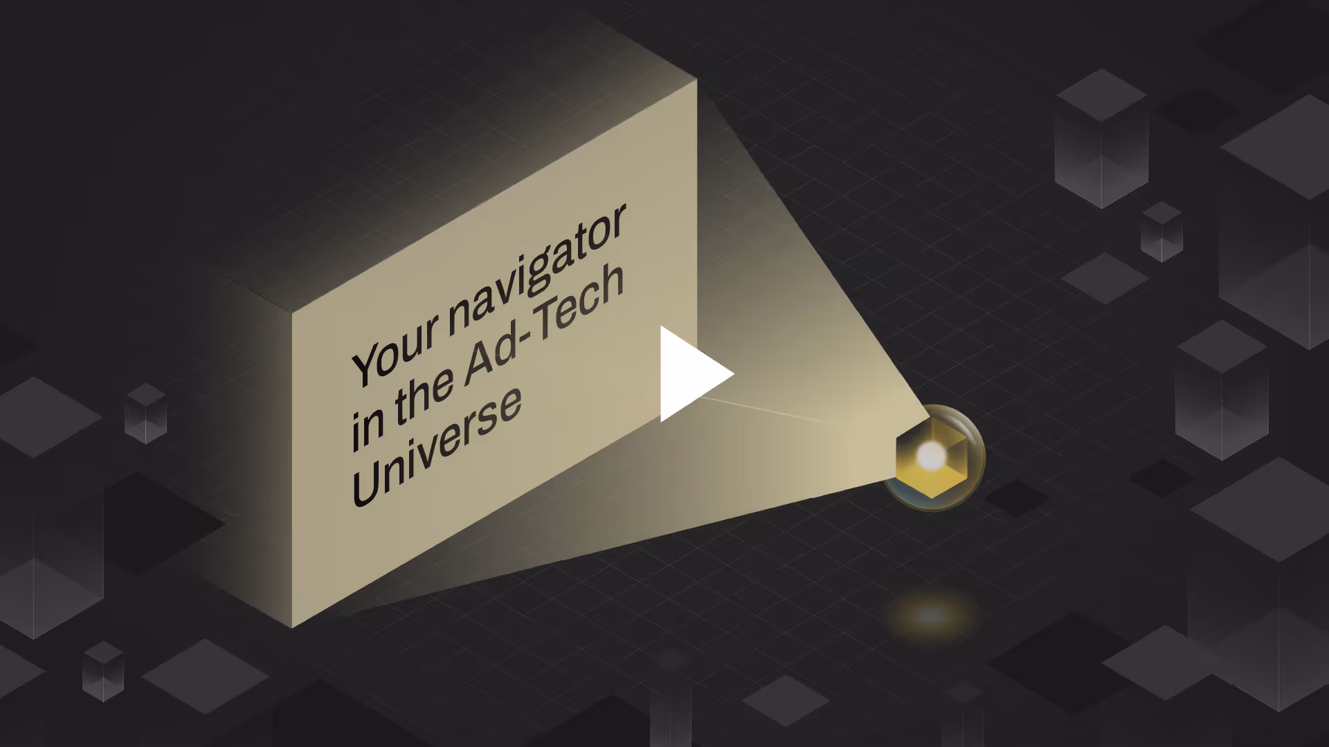
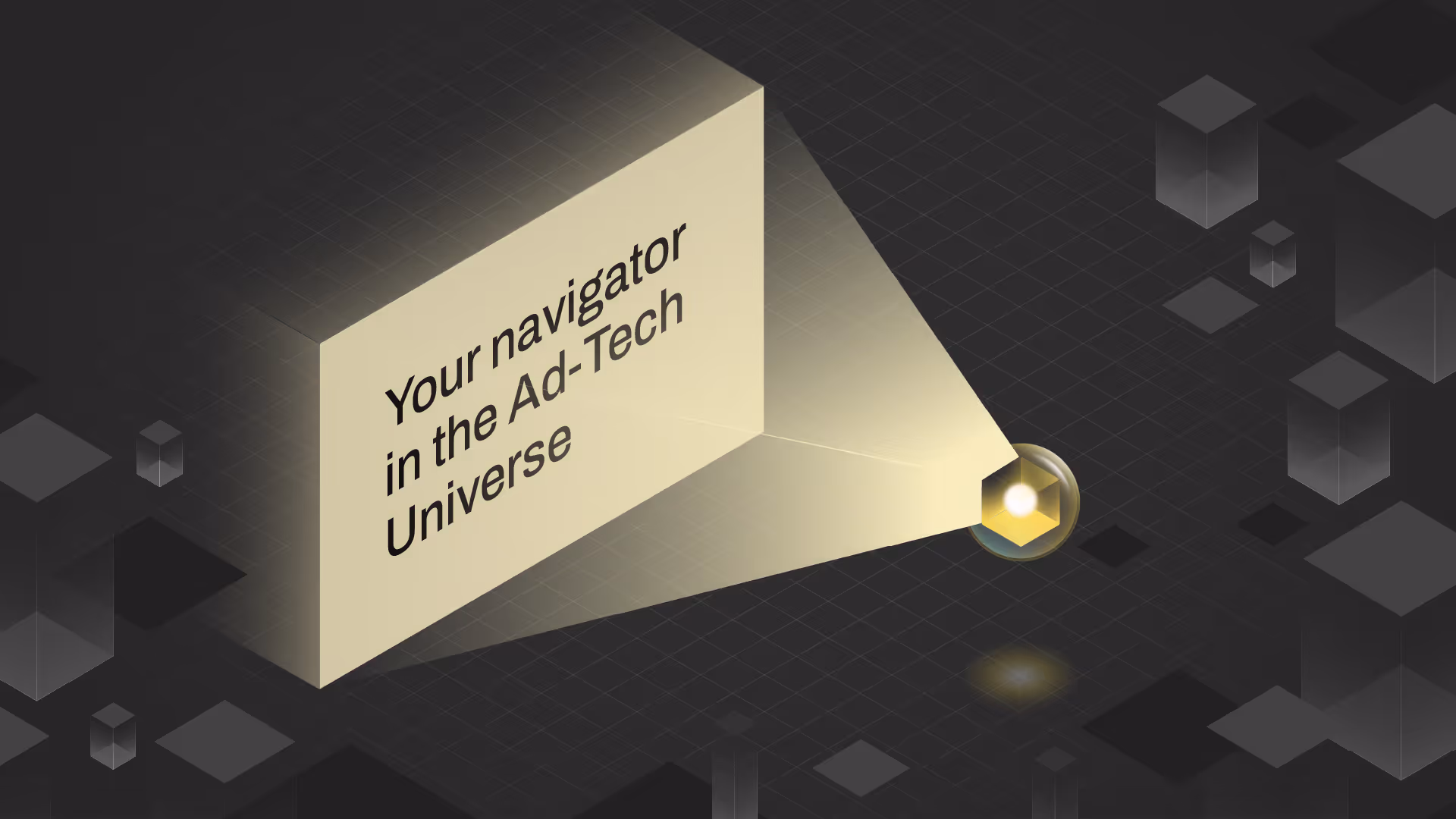
Adnaut's work isn't tangible; they help advertisers navigate complex data ecosystems. The name and tagline naturally pointed toward a guide, a character that could personify the brand and simplify complexity.
This wasn't just aesthetic, it was strategic. A mascot makes the intangible relatable.
This wasn't just aesthetic, it was strategic. A mascot makes the intangible relatable.
The Solution
The mascot was designed with animation as a core requirement.
- Simple structure for easy rigging and movement
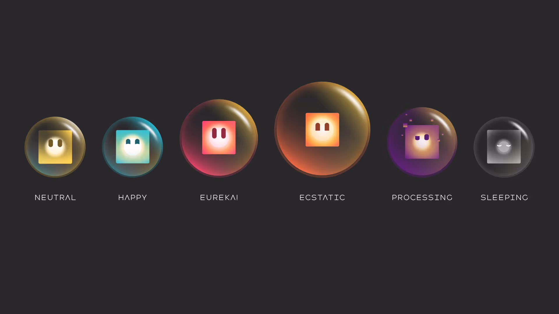
- Wide colour range to support different emotive states
- Layered design to maintain a "glowing pixel" quality in motion
- Flexible expressions and design for use across touch points
The environment was designed to be simple but expansive, allowing flexibility across different brand contexts. This allowed the mascot and environment, paired with the visual identity to be consistent and memorable wherever the brand presented itself.
- Simple structure for easy rigging and movement
- Wide colour range to support different emotive states
- Layered design to maintain a "glowing pixel" quality in motion
- Flexible expressions and design for use across touch points
The environment was designed to be simple but expansive, allowing flexibility across different brand contexts. This allowed the mascot and environment, paired with the visual identity to be consistent and memorable wherever the brand presented itself.

The Solution
The environment was designed to be simple but expansive, allowing flexibility across different brand contexts. This allowed the mascot and environment, paired with the visual identity to be consistent and memorable wherever the brand presented itself.
The Solution
The Brand Film
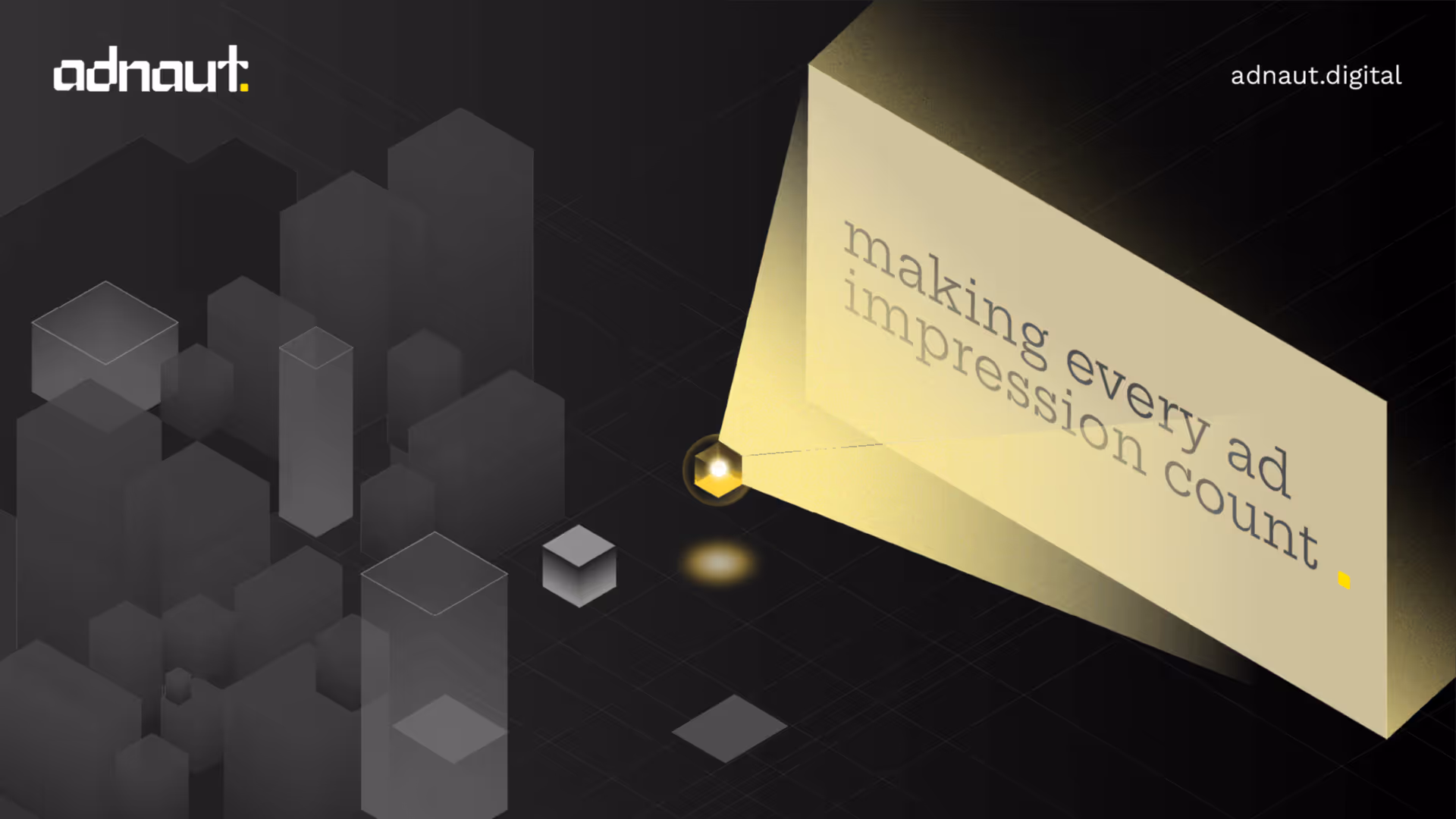
The script was written in-house with a clear objective: create a film that tells one singular story—establish the problem in digital advertising, introduce Adnaut, and communicate who they are, who they are for, what they do and why. Opening with the bold statement "Digital Advertising is an endless blackhole," the script immediately positions Adnaut as the solution. With text-on-screen as the primary delivery method, word choice and pacing were critical considerations.
The team started with getting a good understanding of how the brand works before getting into the storyboard. We developed visual concepts for each script section, charting out how the different brand elements like isometric grids, gradients, typography, the environment, and the mascot, would be used to communicate Adnaut’s brand and capabilities. All these elements were weaved together in animation to integrate the full visual system into one cohesive motion piece.
The team started with getting a good understanding of how the brand works before getting into the storyboard. We developed visual concepts for each script section, charting out how the different brand elements like isometric grids, gradients, typography, the environment, and the mascot, would be used to communicate Adnaut’s brand and capabilities. All these elements were weaved together in animation to integrate the full visual system into one cohesive motion piece.
Constraints
The mascot needed to work across both static and animated contexts while remaining scalable and efficient to produce. Overly complex designs would make consistent animation across multiple touch points difficult to execute and maintain.
As for the brand launch film, the following points were important considerations while working towards the motion piece:
As for the brand launch film, the following points were important considerations while working towards the motion piece:
- Brand Consistency: The film needed to feel like a natural extension of the brand system, not a separate execution.
- Visual Integration: Multiple brand elements (mascot, isometric environment, gradients, typography) needed to work cohesively in motion
- Text as Voice: With no voiceover, the script had to be presented as on-screen text. This required balancing each visual beat with readability, ensuring the message was clear without overwhelming the frame.
- Timeline: Lastly, the project timeline was exactly a week to complete the brand film. Each creative decision had to be taken with the goal of maintaining quality and communication in tandem with the timeline.
Decisions
Early Integration
The motion team was involved during the branding phase, not after completion. This allowed the mascot to be designed with movement built into its DNA — structure, colour, and form were all informed by how it would behave in animation.
The internal brief for both the mascot and brand film was clear and well-defined, which allowed the team to move quickly from concept to execution without ambiguity in direction or messaging.
The internal brief for both the mascot and brand film was clear and well-defined, which allowed the team to move quickly from concept to execution without ambiguity in direction or messaging.
Design Constraints as Creative Direction
The requirement for animatability shaped every design decision. Rather than designing for aesthetics alone, the mascot was built to move, react, and live across different applications.
By designing with motion in mind from the start, the team ensured the mascot could be rigged and animated efficiently, keeping production timelines manageable and maintaining visual consistency across the brand system.
By designing with motion in mind from the start, the team ensured the mascot could be rigged and animated efficiently, keeping production timelines manageable and maintaining visual consistency across the brand system.
Decisions
Animation Decisions
The main animation challenge was making each mascot state feel emotionally distinct while still reading as part of the same family. Every variant needed its own personality, but the motion language had to stay cohesive across the system.
The solution came down to two layers: emotion was conveyed through the eyes and subtle surface details on each mascot state, while a shared floating animation tied all variants together as one unified brand. Each emotional state was mapped to a specific technical function, giving the mascots both character and purpose.
Since the mascot was designed in a 3D isometric perspective, a subtle continuous rotation on the Z-axis was introduced to push the sense of depth and make it feel like it truly inhabits a three-dimensional space.
Decisions
Decisions
The brand film needed to feel three-dimensional to match the visual language of the assets and mascots, which were already designed with a 3D isometric perspective. Most of the animations had to be visualised in 3D while staying true to the established brand system.
The mascot animations built earlier became a major advantage here: they were repurposed in the film, which served a dual purpose. It reinforced brand consistency, making the film feel like a natural extension of the same world. And it optimised production time, which was critical given the tight deadline.
The mascot animations built earlier became a major advantage here: they were repurposed in the film, which served a dual purpose. It reinforced brand consistency, making the film feel like a natural extension of the same world. And it optimised production time, which was critical given the tight deadline.
Decisions
Clear Communication
The video duration was capped to be not longer than 1.5 minutes, the shorter the better. Every piece of script in frame, paired with a visual adding to its communication, was timed for comfortable readability and getting the point across efficiently.
Outcomes
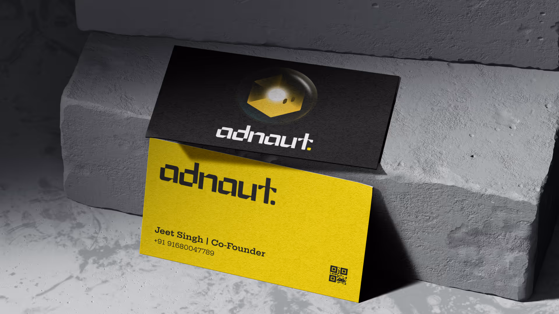
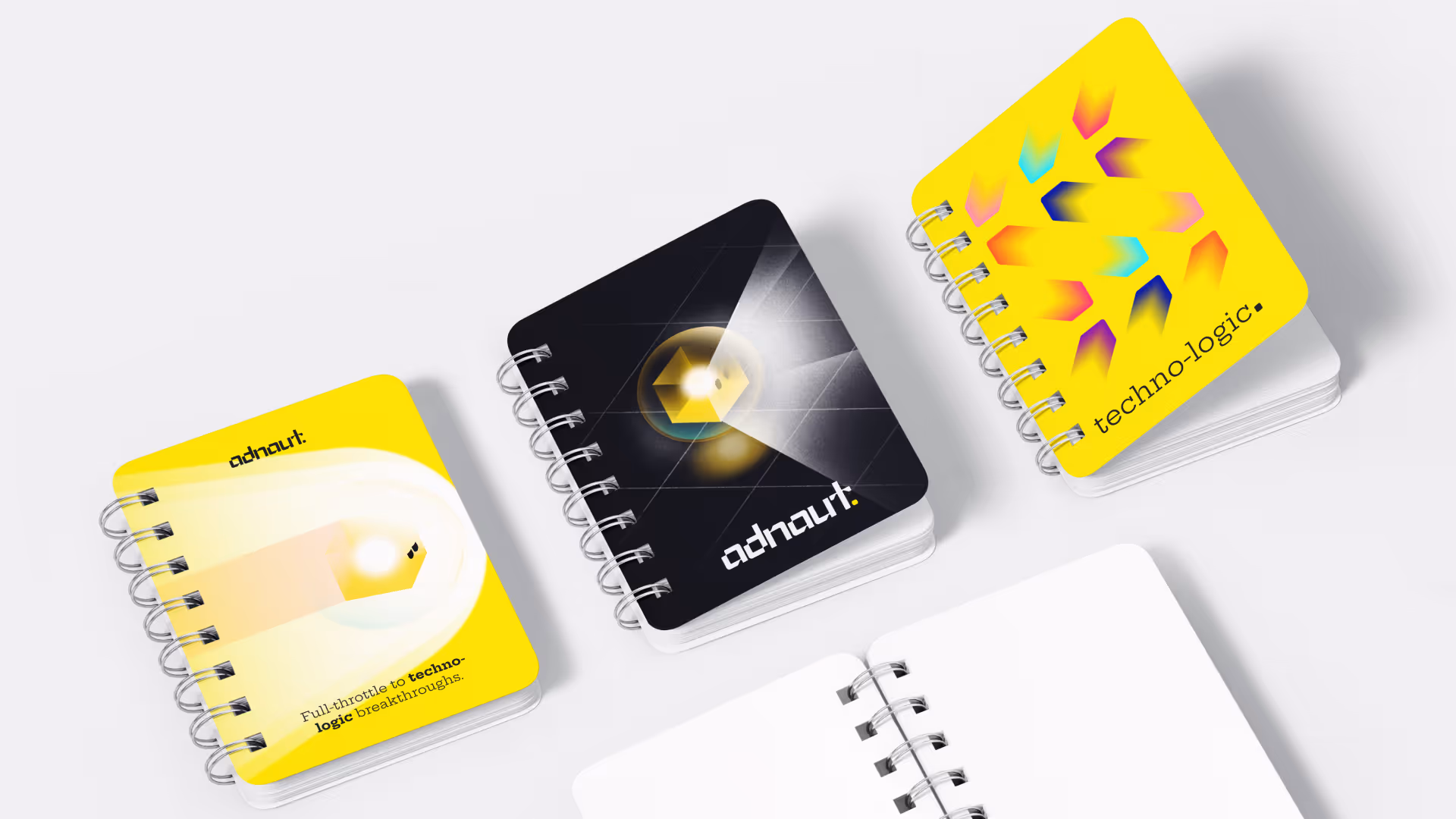
The mascot became Adnaut's primary brand identity asset. Flexible, recognizable, and designed to work across both static and motion applications.
The brand film successfully launched the rebrand, integrating all visual elements into a cohesive narrative. Post-launch, Adnaut saw increased industry recognition and inbound interest from larger clients and talent.
The brand film successfully launched the rebrand, integrating all visual elements into a cohesive narrative. Post-launch, Adnaut saw increased industry recognition and inbound interest from larger clients and talent.
"The brand film was delivered really well within a very short and demanding deadline... When our team saw it, they were blown away. It finally felt like our outward face actually matched the work and abilities we have. It really boosted the morale.”

Nithya S
Managing Director, Adnaut

Key Insight
Involving motion designers during the branding phase, and not as an afterthought, creates brand systems that work more effectively across all touch points. When assets are designed for movement from the beginning, the transition from static to motion is seamless, and scalable.