


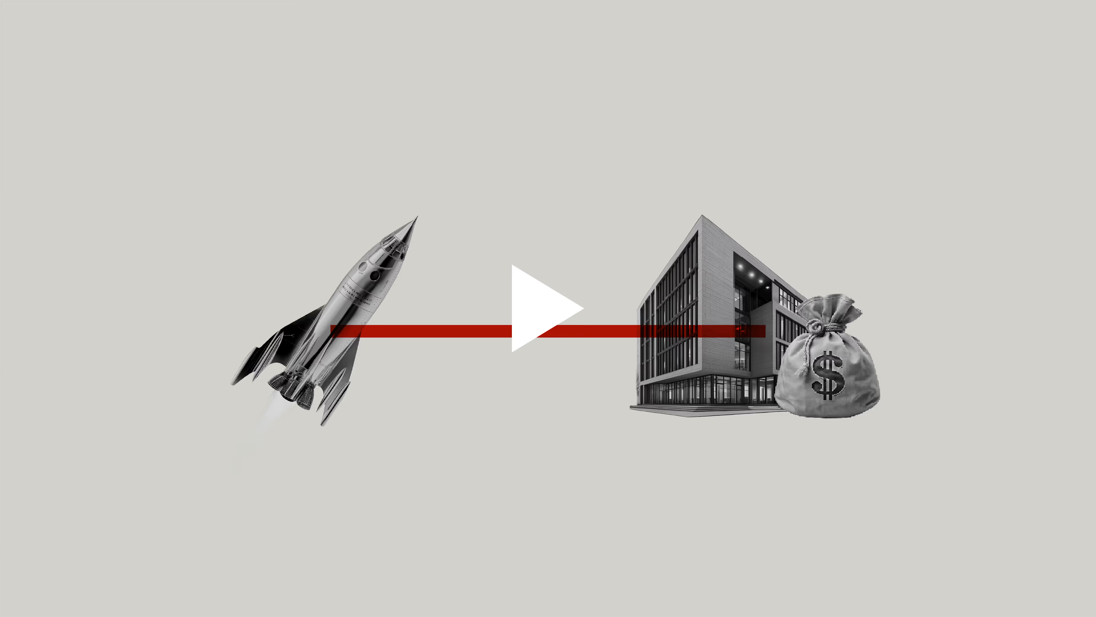
We developed the motion identity and brand launch film for Indian VCs, India's first venture community. We pitched and built a motion system from the ground up, then created the launch films that introduced the brand to the world.

Context
Born from the mind of a visionary, Indian VCs set out to do something revolutionary—create a bridge between stakeholders in India's venture space. But a brand this ambitious needed more than static identity. It needed to move.
Everything Design built the brand from the ground up, from strategy to visual design. When they brought us in to collaborate on the brand, we saw an opportunity. Motion wasn't part of the original brief, but we knew it could elevate the brand from launch. We pitched a motion identity system that would become as integral to the brand as its visual language.
The client agreed. What followed was a motion-first approach to bringing Indian VCs to life: from identity system to launch films that introduced the brand to the world.
The Solution
We developed a motion palette built on "extend and pull" - movements that feel like bridges forming, links being made. Everything needed to move with grace, not aggression, reflecting the brand's authority without alienating its audience. The rhythm follows two beats, creating a visual cadence that's confident and deliberate.
This wasn't decoration. It was brand strategy expressed through motion. Transitions don't just move between scenes, they connect ideas. Text doesn't just appear, it extends into frame with purpose.
The Solution
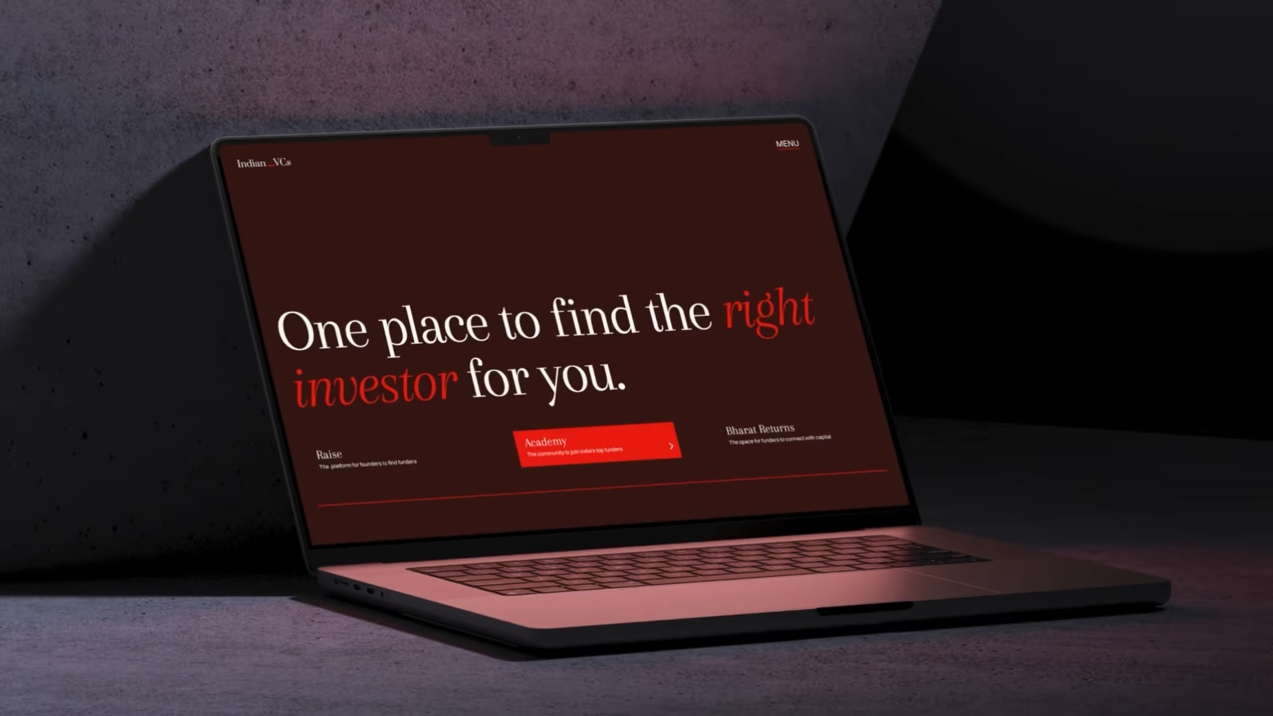
We wrote the script, developed the storyboard, and designed each frame to reflect the brand's visual system: the brand typeface, colour, and imagery, all in the right proportion to the white space. The motion identity we'd built governed every animation, ensuring consistency and coherence.
Music played a quieter but equally important role. The track needed to balance the brand's grace and authority with the ambition of its mission.
The Solution
The Solution
Constraints
Decisions
We treated motion identity with the same rigour as the visual identity. We defined the motion palette for Indian VCs with the following
Extend & Pull: Emulate the idea of bridges, of connecting things. Movements that stretch or compress to express elasticity and energy. Eg., Buttons that expand before snapping back, lines that pull outward before settling, or shapes that stretch to guide attention.
Graceful: Graceful motion embodies the refined and purposeful approach Indian VCs takes in fostering innovation. It symbolizes the deliberate and measured progress—everything moves with intent, as investments and opportunities are nurtured and allowed to grow organically, with no rush. Eg., Soft easing curves, smooth scaling, and subtle transitions that evoke balance and poise.
These decisions weren’t just aesthetic choices, but a translation of the brand's core function and personality. Indian VCs connects; the motion system embodies connection.
Consistency is what establishes distinctiveness. We matched the colour and type proportions that define the brand and maintained them throughout—ensuring that every frame, whether in motion or paused, unmistakably belongs to Indian VCs.
Outcomes
The brand film successfully launched the rebrand, integrating all visual elements into a cohesive narrative. Post-launch, Adnaut saw increased industry recognition and inbound interest from larger clients and talent.